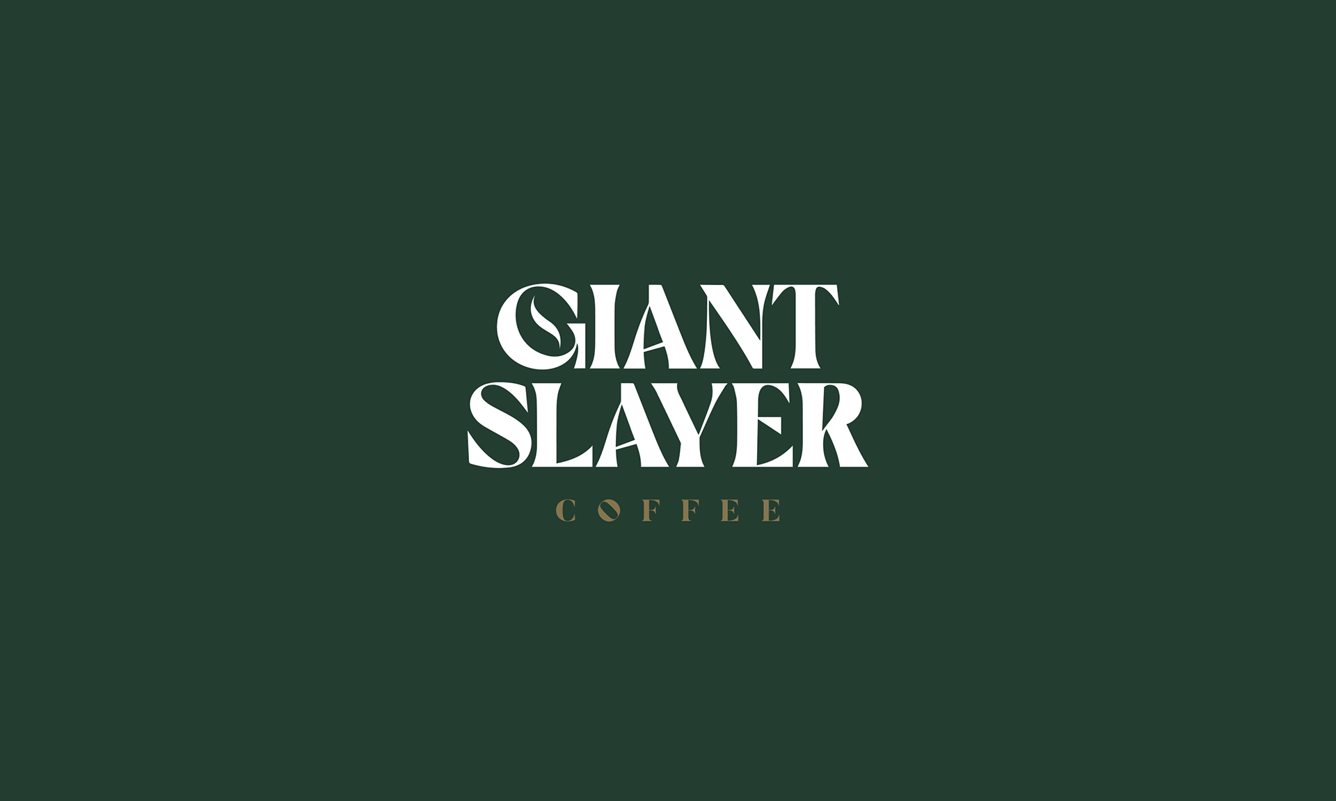
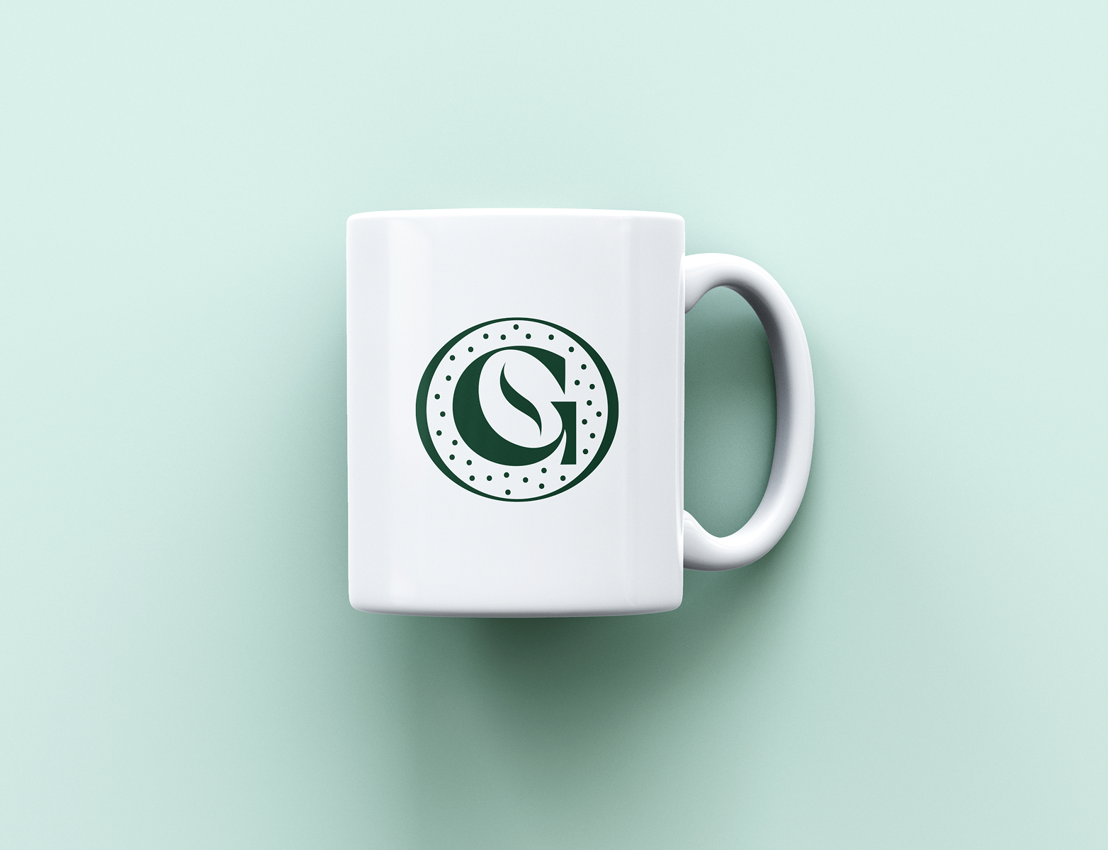
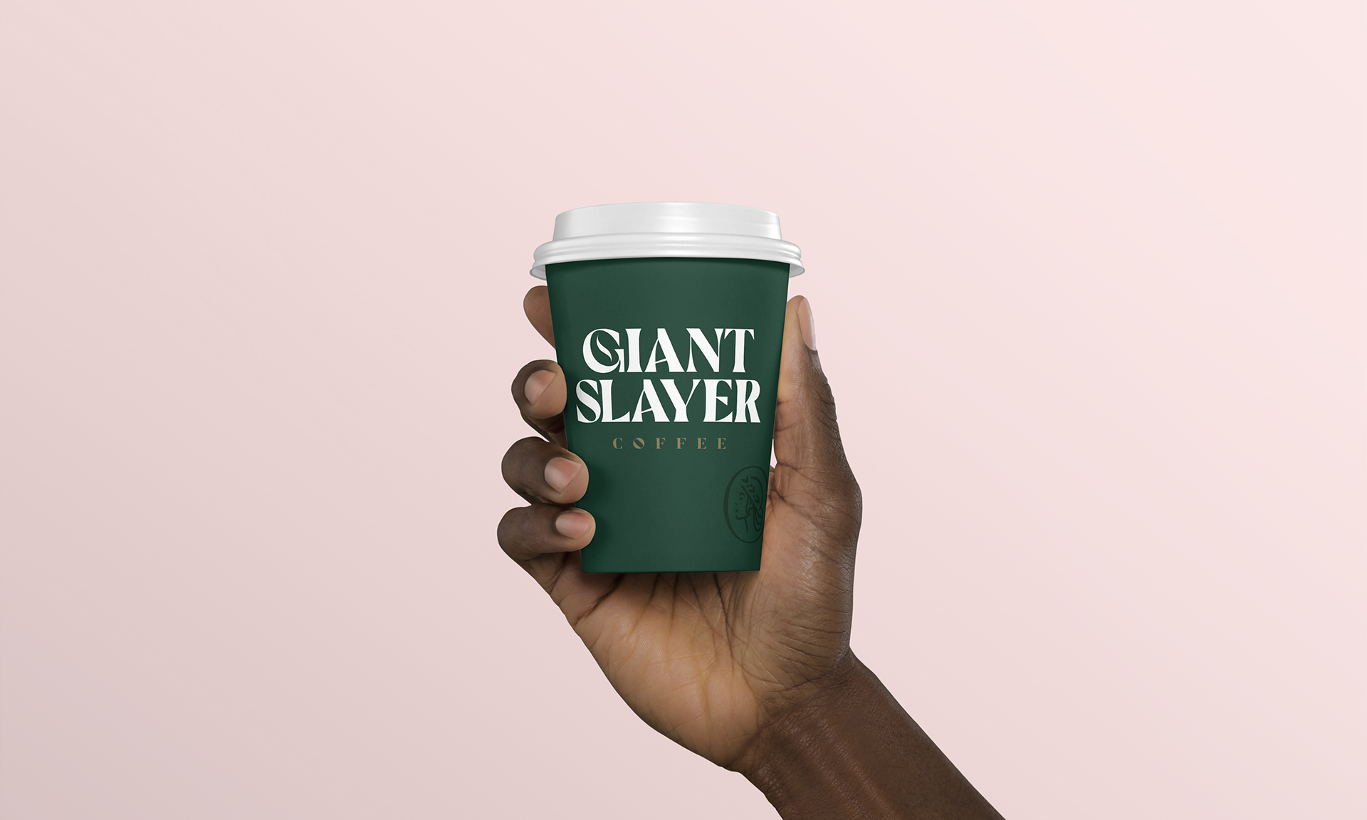
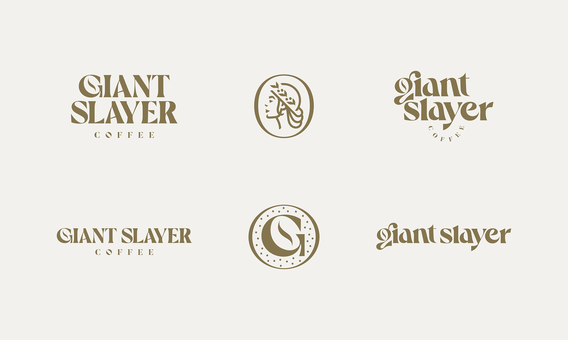
What a name for a coffee company! I had a blast collaborating with the founders of Giant Slayer, not only because the name lent itself to some really fun exploration, but because the brand was rooted in both their underdog mentality and their family. There's not one, but two slightly unique logotypes with multiple ways of displaying them and two marks that can be added to their products to bring it all together.
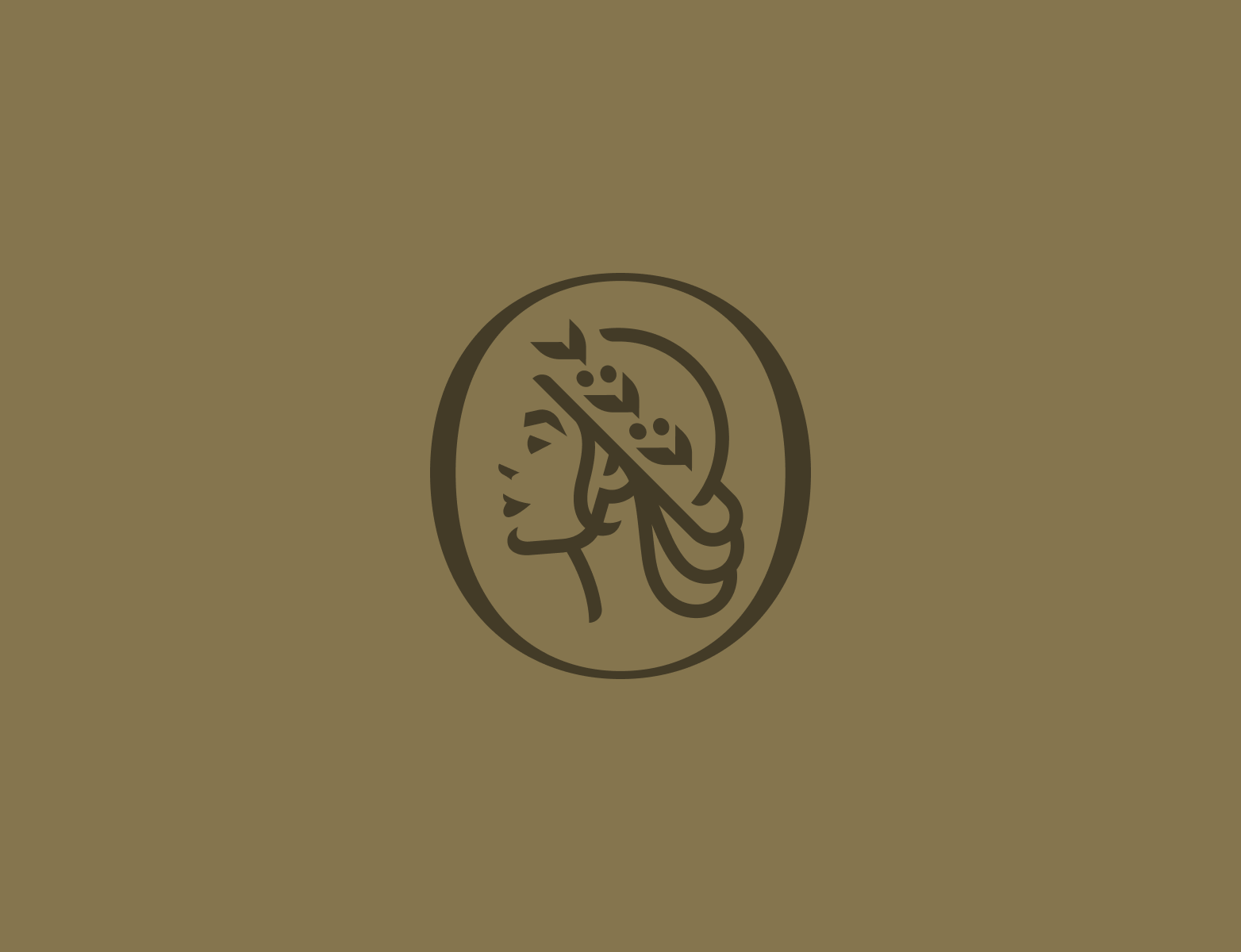
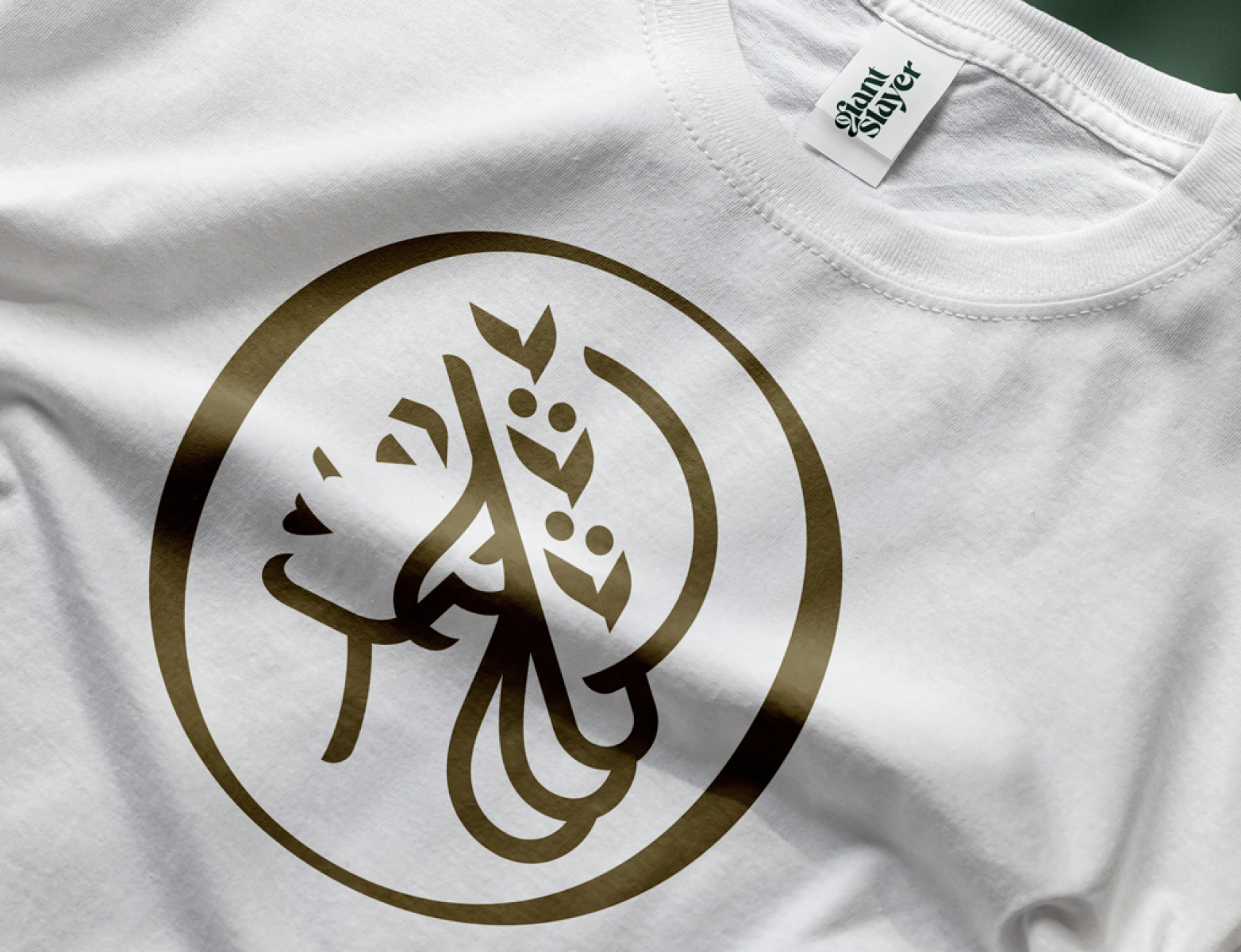
My favorite part of the solution is the logo of the girl. First, she is the giant slayer, but more importantly, it's based on a photo of the owner's daughter. The helmet is created from a coffee cup that is adorned with the fruit that coffee comes from.
My favorite part of the solution is the logo of the girl. First, she is the giant slayer, but more importantly, it's based on a photo of the owner's daughter. The helmet is created from a coffee cup that is adorned with the fruit that coffee comes from.
Logo Development
Brand Guides
Visual Direction
Brand Guides
Visual Direction